ContentSquare's Digital Analytics Benchmark Report
How might we present user behavior insights, from 9+ billion sessions across 9 industries to e-commerce executives & generate leads to ContentSquare?
ContentSquare's Digital Analytics Benchmark Report
Type of project
Data-Visualization
My role
UX/UI Designer, Project Manager
Tools
Paper, markers, Adobe Illustrator, Adobe Photoshop, Sketch, Invision, Sublime, Spreadsheets, and Monday.com
Deliverables
User flow, landing page, plug and play widgets, assets for a 360 marketing campaign.
Client / Owner
ContentSquare (www.contentsquare.com)
Year
2018

The Project

_
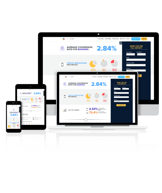
ContentSquare is a digital experience insights platform that helps businesses understand how and why users are interacting with their app, mobile, and websites, computing billions of touch and mouse movements, and transforming this knowledge into practical actions. The question was: how might we present user behavior insights, from 9+ billion sessions across 9 industries to e-commerce executives & generate leads to ContentSquare?

The Goals and Challenges

_
Create a digital interactive experience using live data based on 9+ billion user sessions from 15 countries. The data represents 105 eCommerce sites across 9 industries. Also to establish ContentSquare as a leader of industries’ data and generate leads.

1 – Research & Understand

_
Learn more about digital reports and interactive data visualization, listen to the data collected by the data analysts, understand about the industries and how to create an experience without overwhelming the user with animation and information.

The team was spread out in 2 continents: data analysts in Paris, UX/UI, Content and Marketing in New York, and developers in Rio de Janeiro.

Listen to the data – after using Artificial Intelligence to extract insights from the data, we found out massive numbers:

How might we create a journey to show massive numbers,
without overwhelming the user?

2 – Sketches & Wireframes

_
Sketch user flows for landing page scenarios; share with stakeholders the experience and collect feedback.

LEVEL 1 – Create a widget to plug and play on the
ContentSquare’s homepage and also to be used by itself.

LEVEL 2 – Create a landing page showing some of the number,
the findings and the methodology used to create the report.
Also,  a form to link to Hubspot.

LEVEL 3 – Create a digital report, where users could
read the ContentSquare’s analysis and check
six KPT’s per industry, covering three devices.

3 – Decide & Design

_
Create a design system for the report, based on the ContentSquare’s Brand Guidelines, mixing marketing concepts and data-visualization.

High-end Visuals:

Step 1, the widget:
ask how the users rank against their competitors, letting them select their industry.

Step 2, the landing page:
The first section gives the user the selected industry average CVR, the traffic breakdown per device an more interesting data.
The next section explains more about the findings of the report and the methodology used to discover the data.

Step 3, the report:
Create an easy to navigate report,  providing a ContentSquare analysis of user behavior across 9 industries with a minimalist design approach,  making the user experience a comfortable environment while reading massive information.

4 – Prototype

_
We created a desktop prototype version to test the navigation, the effects and the journey we envisioned.

5 – Test & Validate

_
After testing the prototype and validating with the stakeholders the goals for this campaign, we implemented using HTML, CSS, and JavaScript, connecting it to HubSpot.

The Outcomes

_
ContentSquare was able to create a full interactive report and establish as a leader of data for all industries, reinforcing that data can support future UX decisions.

The final version was launched in four languages: American EnglishFrenchGerman, and British English.